Senior Power BI consultant · Boston, MA
Power BI dashboards you can finally trust.
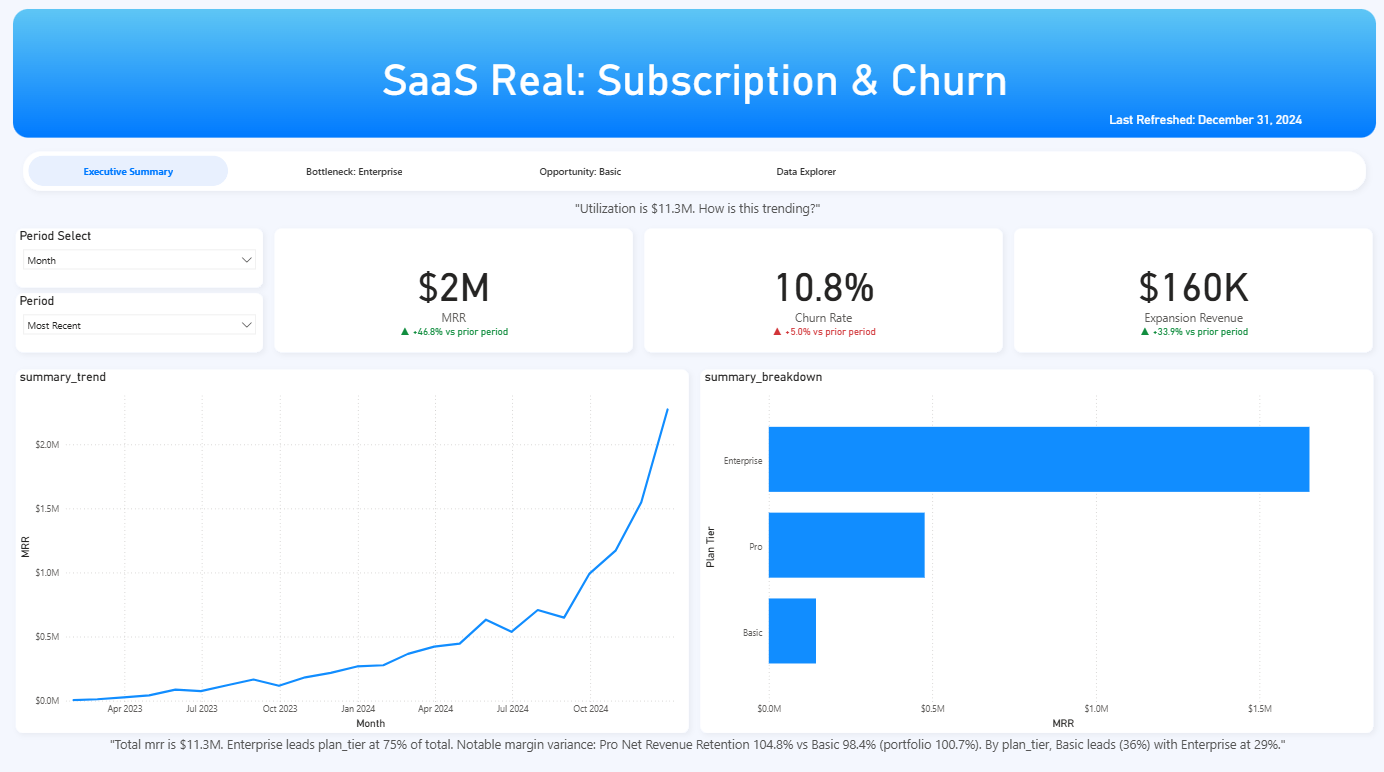
You run on spreadsheets and gut feel. I build the Power BI dashboard that becomes your single source of truth, and I get it right the first time.

Garrett Bellinghausen